Behind the Design: Illustrations
Case Study
5.25.25
By — Christian Smith

Copied!

Process
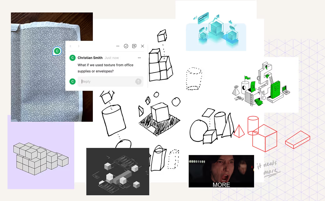
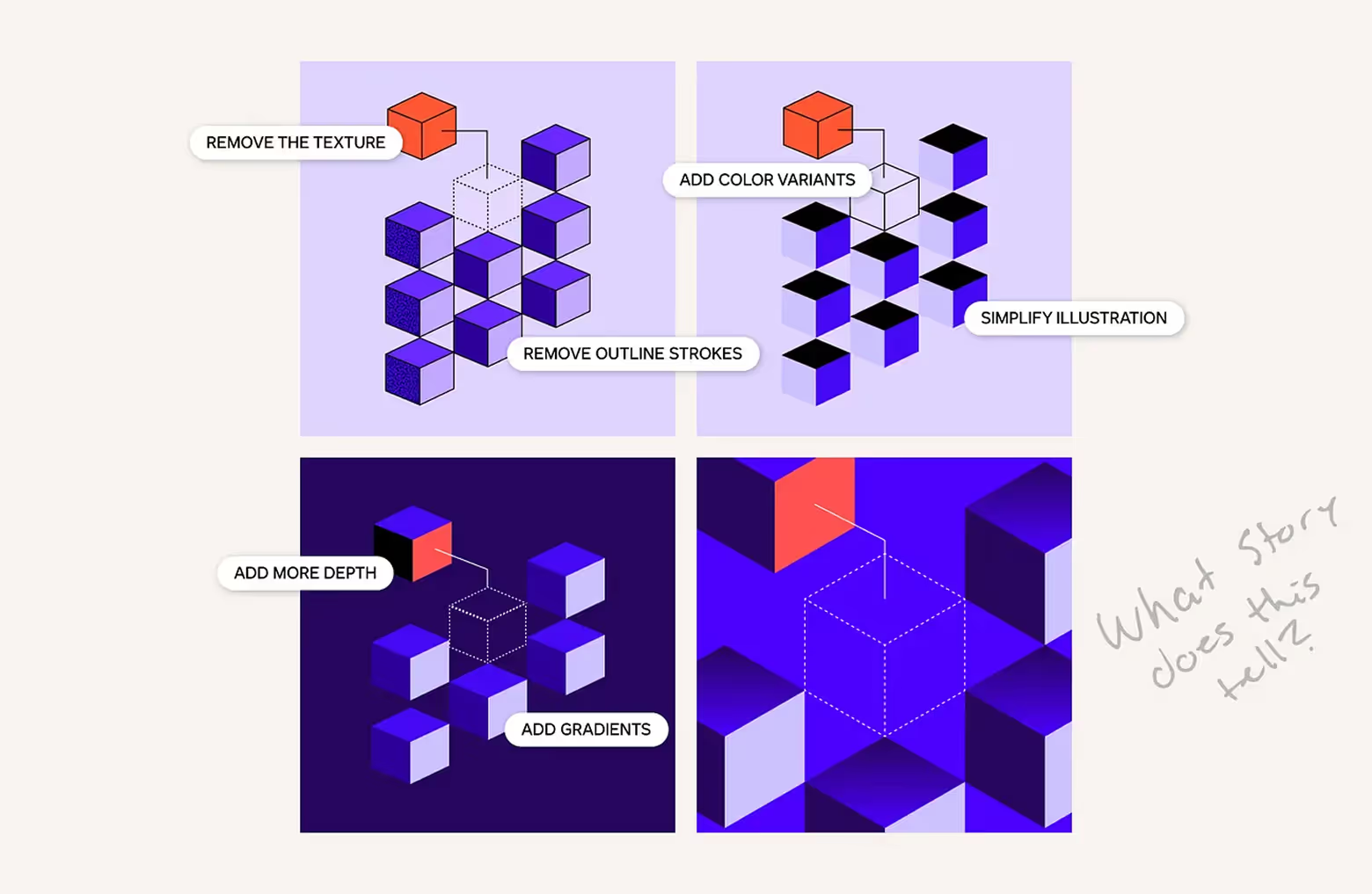
In the past, we struggled to create an illustration system that really worked for us. We needed something accessible, something they could use and build on without always needing an illustrator. So, we set out to make it happen.We started by designing illustrations that worked alongside our pictograms. We quickly stumbled upon the isometric style we use now. We went through multiple rounds of tweaking the strokes and gradients until everything came together in a way that felt cohesive and polished.
Strategy
Every choice we made had a purpose.
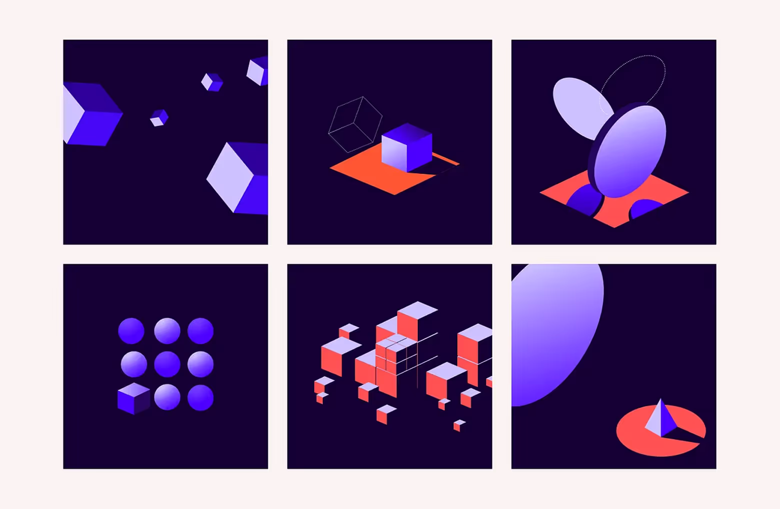
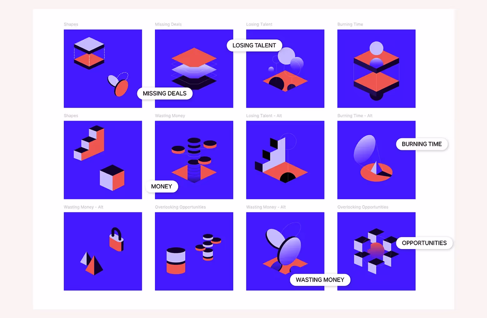
We had several ideas that turned into bigger concepts. For example using platforms or holes in our illustrations. At first glance they’re just simple shapes, but they gave us a creative way to tackle some abstract ideas. The hole for example could represent losing money or falling into a problem, while a platform could symbolize stability or opportunity. These elements became the building blocks for telling visual stories in a way that’s easy to understand.
We had several ideas that turned into bigger concepts. For example using platforms or holes in our illustrations. At first glance they’re just simple shapes, but they gave us a creative way to tackle some abstract ideas. The hole for example could represent losing money or falling into a problem, while a platform could symbolize stability or opportunity. These elements became the building blocks for telling visual stories in a way that’s easy to understand.
We also chose to build the system on an isometric grid because it gave us so much flexibility. It’s perfect for representing things like modularity or interconnectedness. Ideas that are central to who we are and what we do. At the same time, the grid keeps everything consistent, no matter how we adapt or expand it.
This flexibility was crucial. We didn’t want an illustration system that would feel “finished” after launch. We needed something that could grow with us. And it has. Since launching, we’ve already doubled the size of our library, cropping and animating elements in new ways that bring even more personality and energy to the system.
This flexibility was crucial. We didn’t want an illustration system that would feel “finished” after launch. We needed something that could grow with us. And it has. Since launching, we’ve already doubled the size of our library, cropping and animating elements in new ways that bring even more personality and energy to the system.
Meaningful Illustrations
Showcase


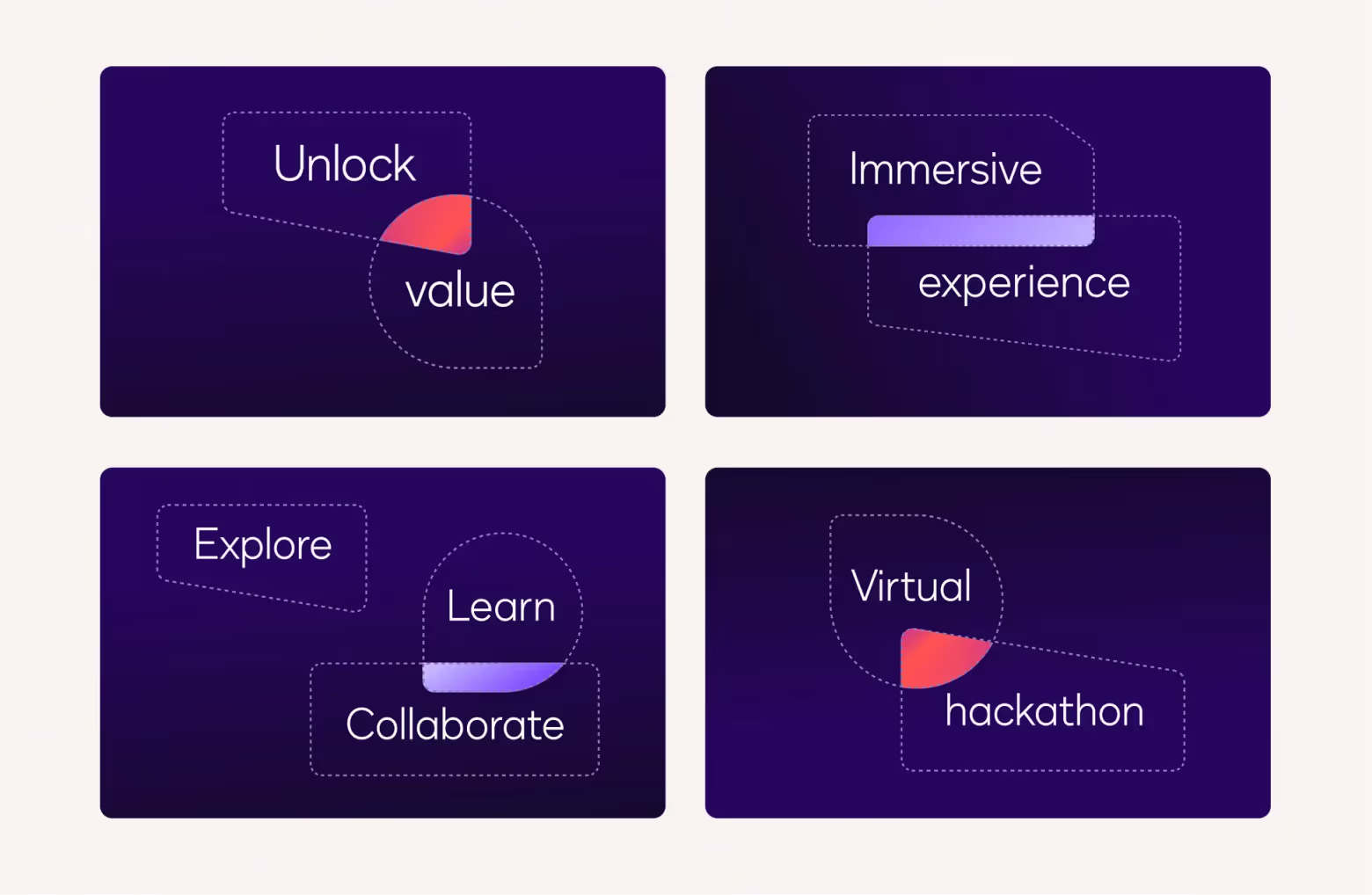
Our illustration system has quickly become one of the most recognizable parts of our brand. Below are some examples of how the system works in the real world, showing off its range and versatility.

Our illustration system has quickly become one of the most recognizable parts of our brand. Below are some examples of how the system works in the real world, showing off its range and versatility.