Elements
Our agreements take shape through brand elements that help establish our unique visual identity and strengthen brand recognition.
These elements are a comprehensive ecosystem that we use to illuminate our creative platform or dynamic connection.
These elements are our tool belt, allowing us to communicate concepts with clarity in every brand application.
Each component serves a distinct purpose while contributing to our unified brand expression.
Considerations


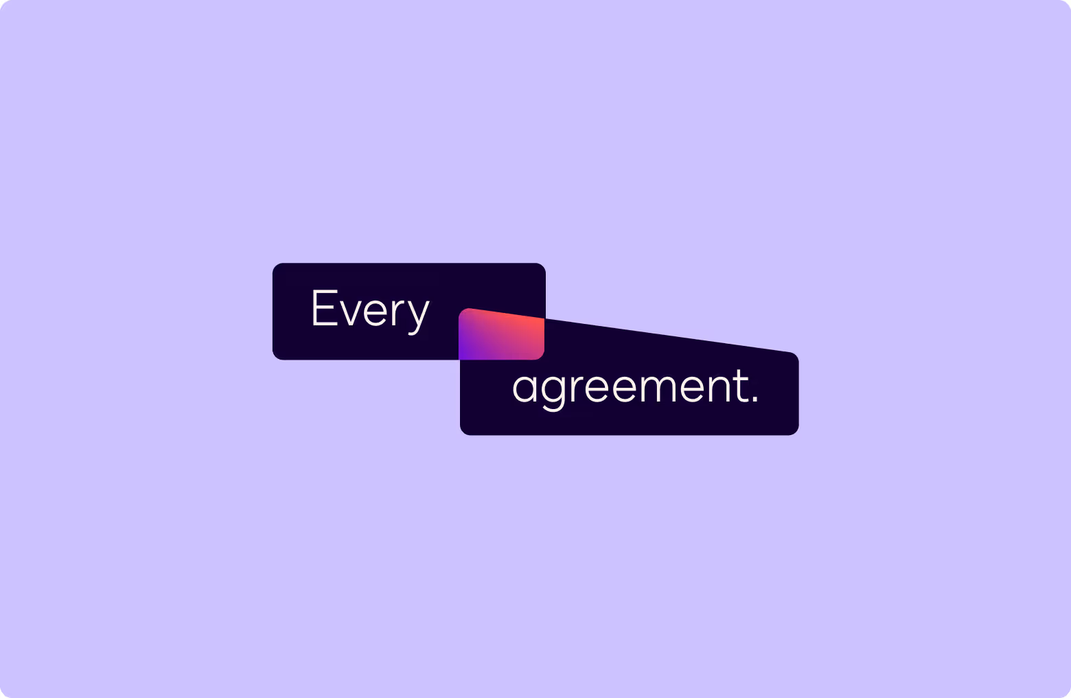
The dog-eared angle on the document shape, derived from the center of our Nexus, is always 45°. When scaling this shape or using the document-shape as a container, overlay stroke, or other graphic element, always keep the angle at 45°.
Geometry
Our pictograms, illustrations, and other visual elements are inspired from a basic set of geometric shapes. While variations are sometimes needed to tell a specific story, these basic shapes should be used as a starting point.
Pictograms
Pictograms serve as spot illustrations and act as a visual expression of our products, services, verticals, and capabilities. Our pictograms are not intended to be used in functional interfaces. They are simple, colorful, bold, and serve as abstract representations of broader Docusign concepts. While each is visually distinct, all pictograms for Docusign should be unified through stylistic execution.
Illustrations
Our illustration family serves as a larger-scale representation of our pictograms and observe many of the same basic ideas. To infuse more depth and dimensionality, illustrations are created on an isometric grid taking the spirit of the pictograms and adding scale—bringing them to life.
Our illustration family serves as a larger-scale representation of our pictograms and observe many of the same basic ideas. To infuse more depth and dimensionality, illustrations are created on an isometric grid taking the spirit of the pictograms and adding scale—bringing them to life.
Intersections
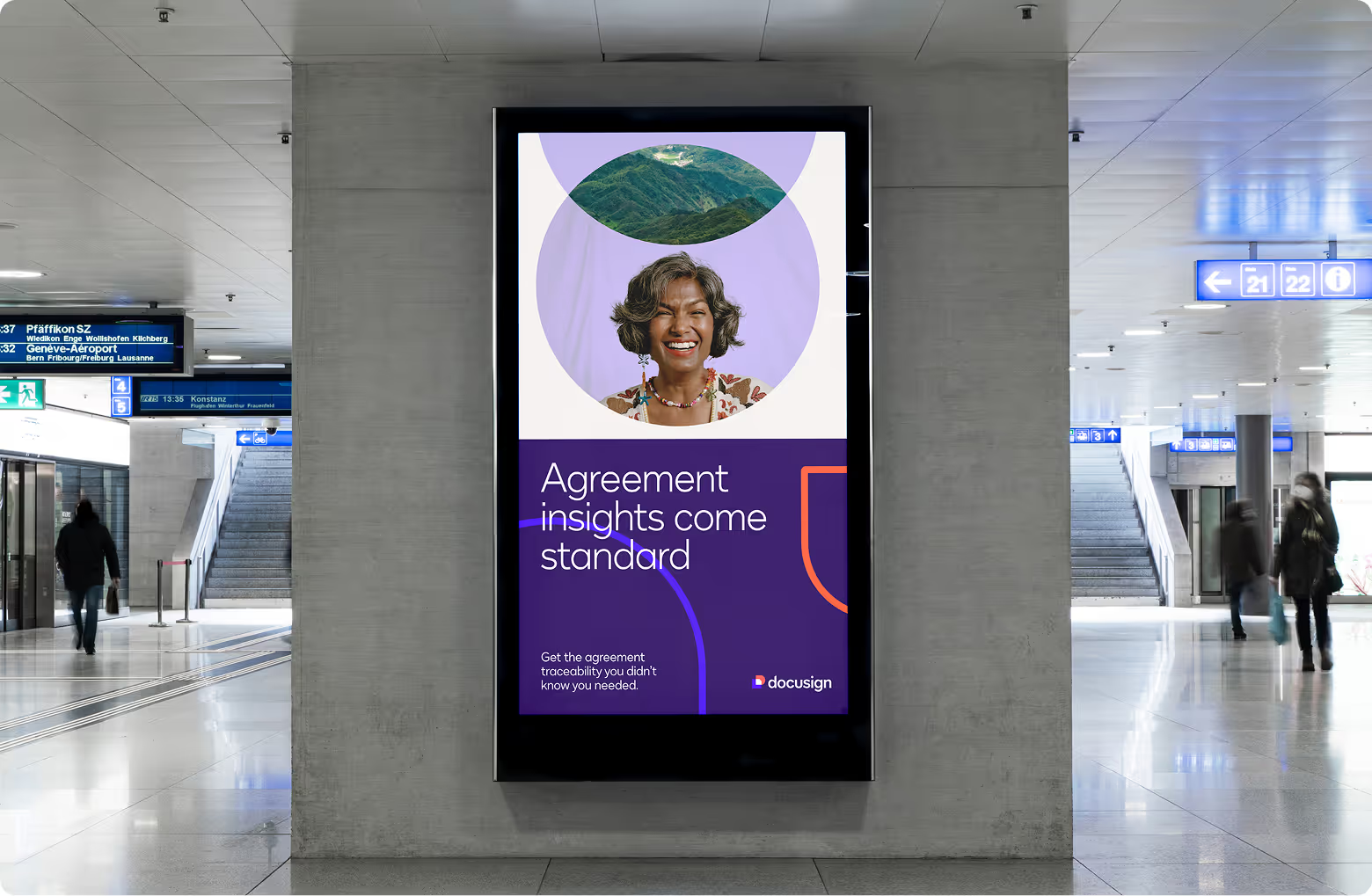
Intersections are one of the best representations of the visual principles of Connection and Dynamism. These graphics demonstrate where the brand system’s geometry becomes more animated and alive when two or more objects intersect: shapes can contain photography or typography and generate a new pattern, texture, or gradient where they overlap. Outlined geometry can also be used in the background to create textural patterns.
Glassmorphism
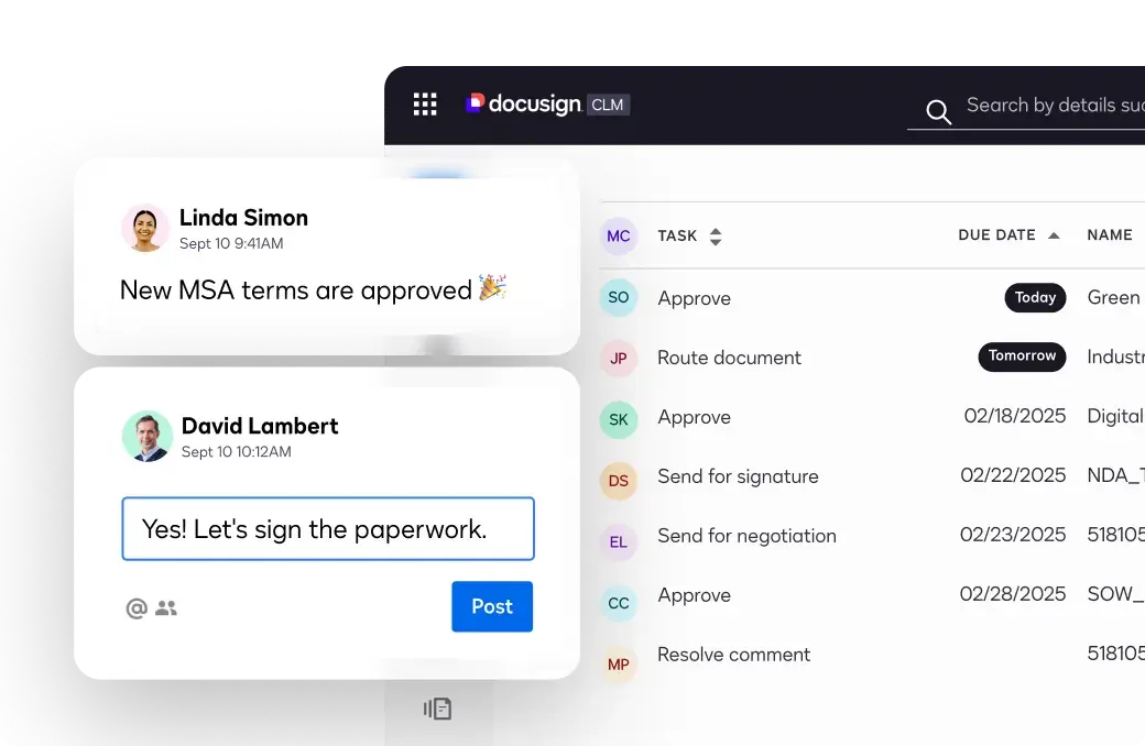
We can further show the dimensionality of our Animating Agreements visual principle by utilizing geometry that has a subtle glass-like effect to it—where it overlaps with and intersects other graphics or photography to show that there is an opaque, layered relationship between the two objects. This echoes the overlapping shapes of our Nexus icon to bring the concept to life.

Bringing Agreements to Life
Easily create, send, sign and manage every agreement—all in one place.

Glassmorphism in Graphic Elements
Glassmorphism in Animation
The glass effect works best with subtlety and restraint. In the example shown to the right, the fill opacity on the box walls in front are set to 24%, with a 12% background blur applied. This allows for a good amount of Pass Through blending, while still retaining a clear foreground shape.
Data Visualization
Data communicates complex concepts, trends, and patterns in an impactful way. Data visualization allows us to make dense information clear, accessible, and easy to understand.


