Product
Product is where our brand story becomes reality. We tell our customer's stories, and ours, through these small UI moments.
These interfaces create a tangible concept of what Docusign can offer, and we use them with purpose.

The offer looks great!
Awesome, I’m sending you the contract to sign ✨
Easy. Done! ✅
Product Imagery
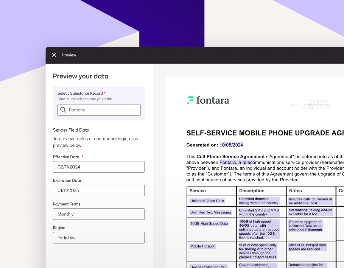
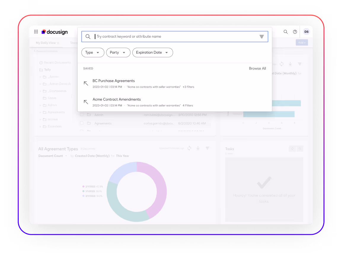
Docusign’s interface may be represented in three distinct ways: high-fidelity interfaces, simplified interfaces, and interfaces in device photography.

When choosing between these representations, we recommend asking: what will help bring more clarity in order to get the message across?
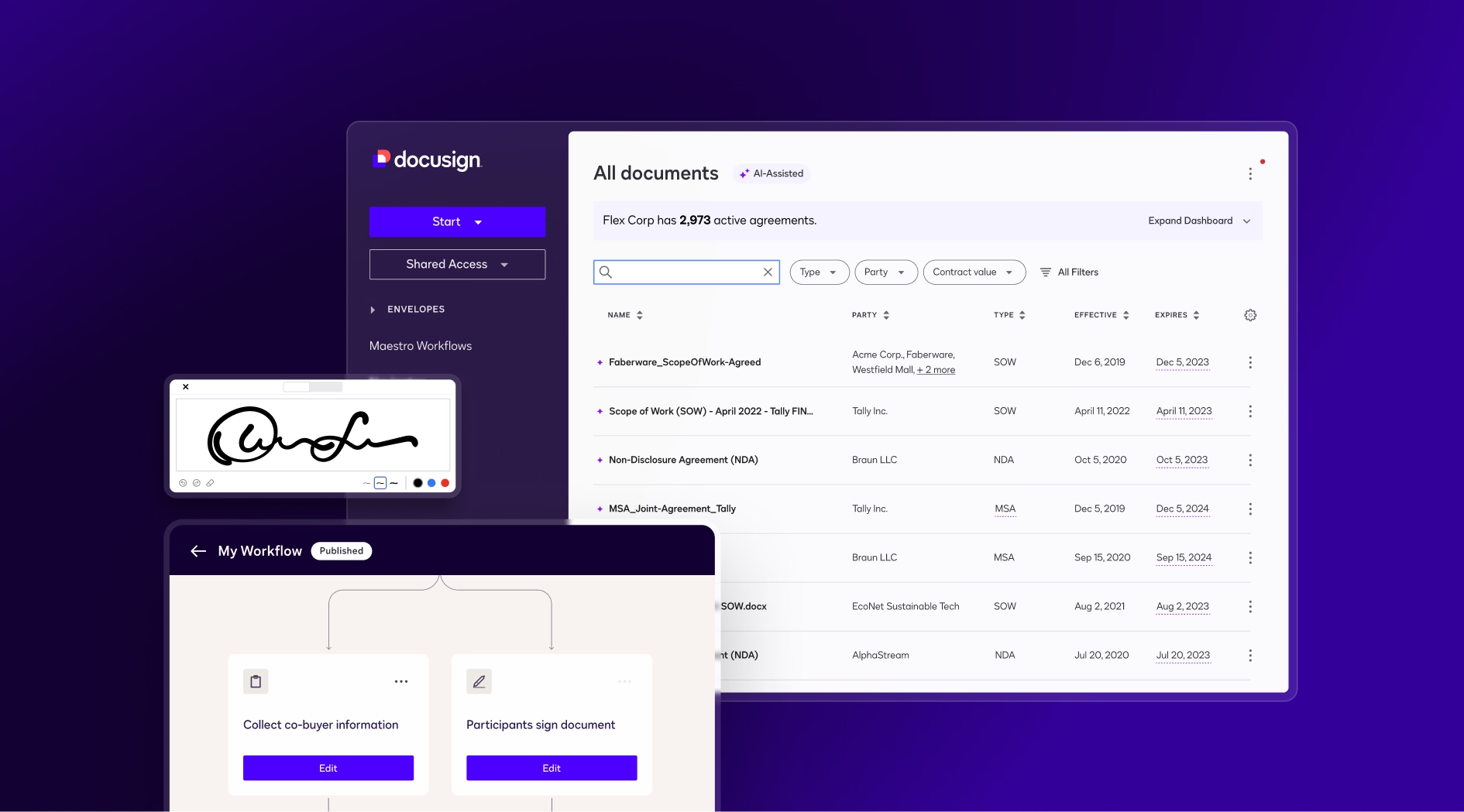
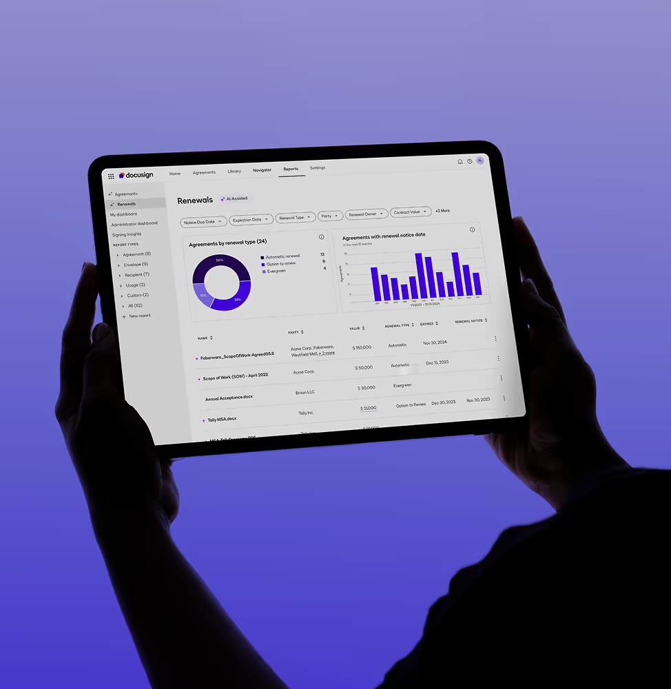
High-fidelity Interfaces
Simplified Interfaces
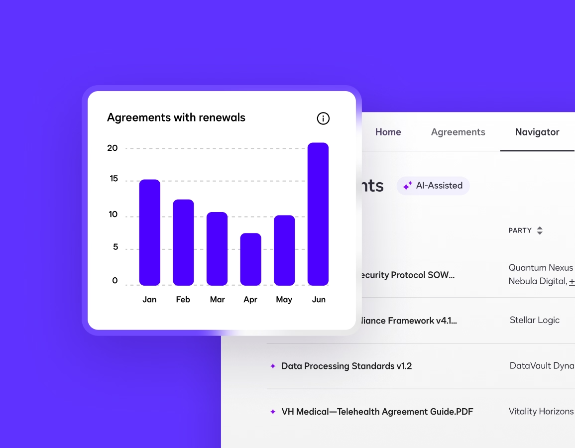
These user interfaces abstract parts of our products by simplifying complex screens with many lines of text in order to focus on a specific feature. An interface element can be enlarged or pulled out of the device frame to clarify the feature when the full view would complicate the message that the visual is attempting to get across.
Interfaces in Photography

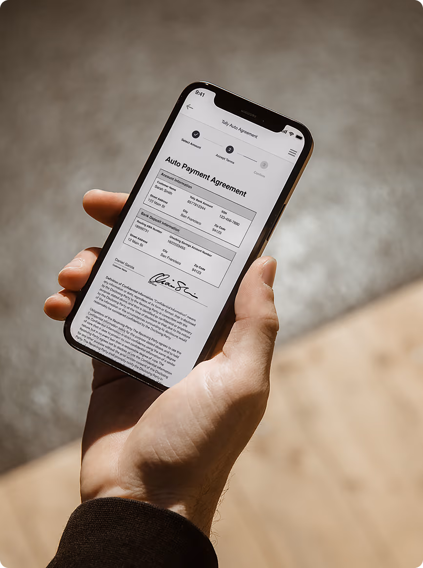
All other rules for the imagery itself should follow the guidelines for Photography.
Device Frames
This thin line has a gradient stroke and rounded corners whose radius should complement the radius on the device screen inside of it.

Considerations
Never use realistic device frames
to show product UI other than in a photograph.
While use is preferred, if the stylized device frame distracts from the design it may be omitted.
Considerations
The device screen itself can have a subtle drop shadow to give dimension. A Poppy-to-Cobalt gradient is preferred, but if it distracts in the design, the gradient can fade to the background color.
Examples: If the gradient line is on a Cobalt background, it can either fade to Cobalt or it can fade to Deep Violet for more contrast.