Photography
Photography captures authentic moments of connection that bring our brand promise to life through compelling visual storytelling.
Our photographic approach emphasizes real people engaged in meaningful interactions, showcasing the human element behind agreements.

Principles
These are expressed through three guiding principles: Connected, Natural, and Inspired.
Connected

Connected

Connected
Natural

Natural

Natural

Natural
Inspired

Inspired

Inspired

Inspired
We show
Relatable


real people
human

Portraits

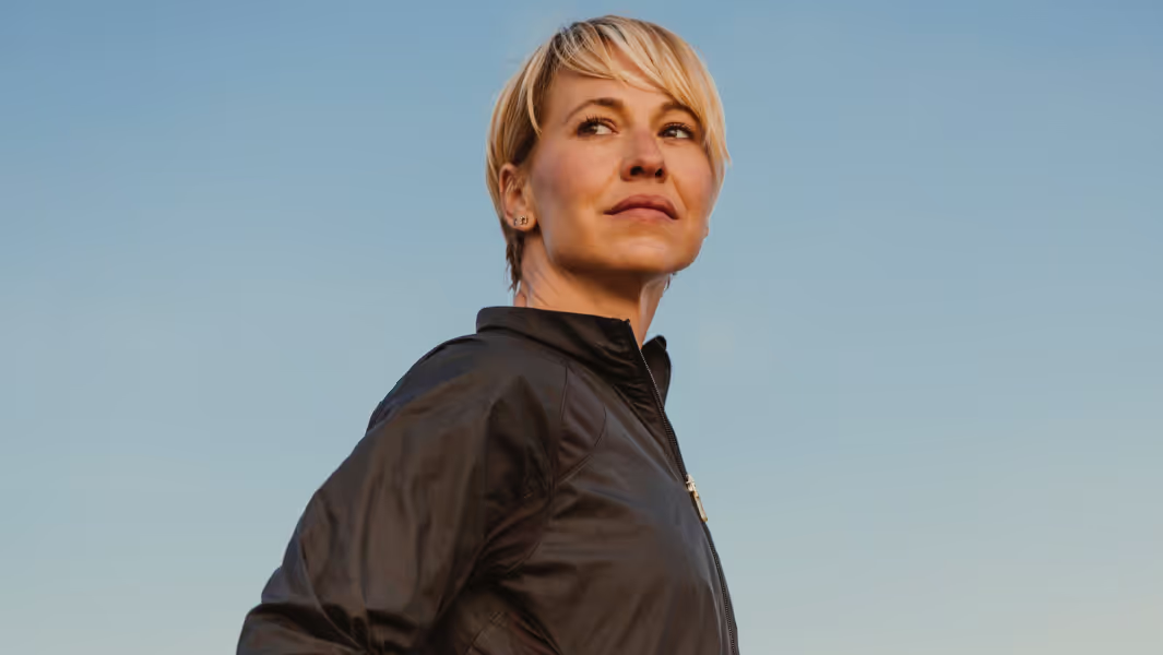


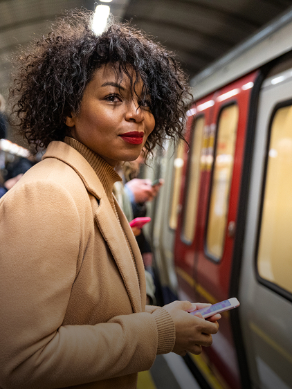
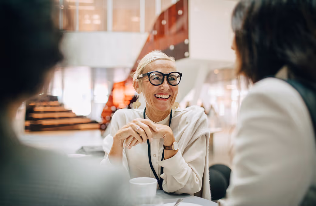
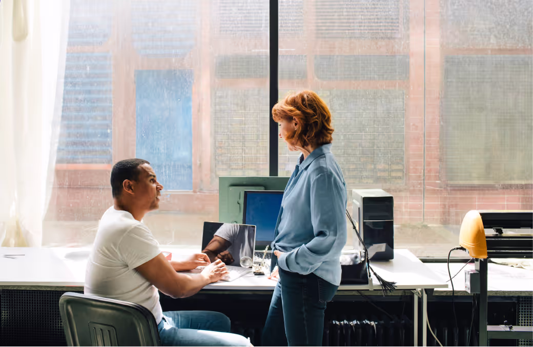
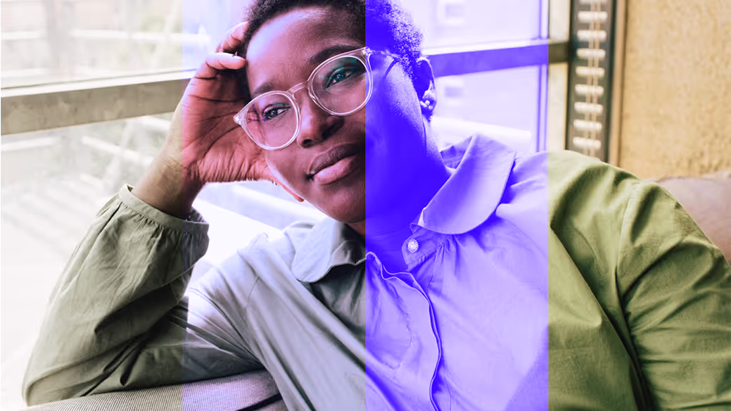
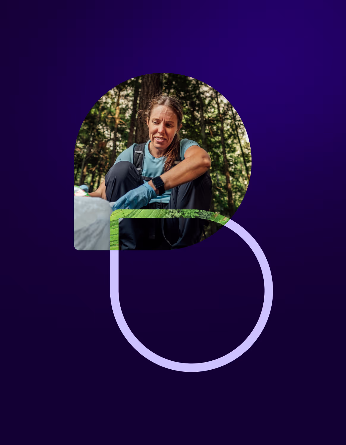
Our portrait photography should be bright and vibrant, focused on the persons with uncluttered backgrounds and shallow depth of field to ensure that they are brought to the forefront and stand out clearly. We follow an editorial-style lifestyle photography approach. Minimal styling should be employed in an effort to showcase real people in real contexts that feel candid, unstaged, and authentic.
Landscapes
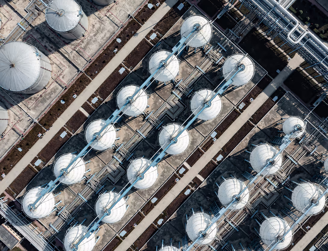
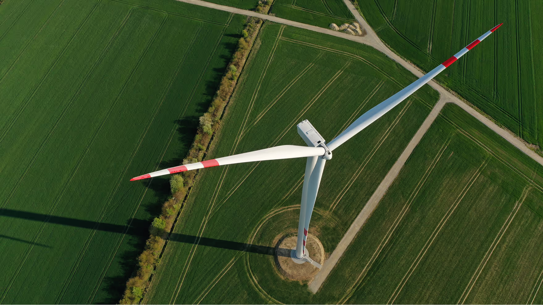
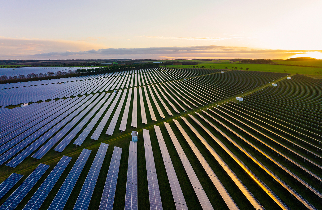
Industry specific imagery provides context and a landscape for brand storytelling. Its composition should be engaging and authentic while leaning on abstract ways to showcase enterprise and small business visuals or close crops to create rich textural backdrops. Choose narratives, environments and textures that tell a story without words.


In most scenarios, landscape and context setting photos will be combined with strong portrait and customer images to tell a larger narrative.
Visual Style

Post-Production
Final photos should have medium-to-high saturation while providing warmth and contrast. They should never be cold or gray, and they should never have washed grading effects placed on top of them as filters.


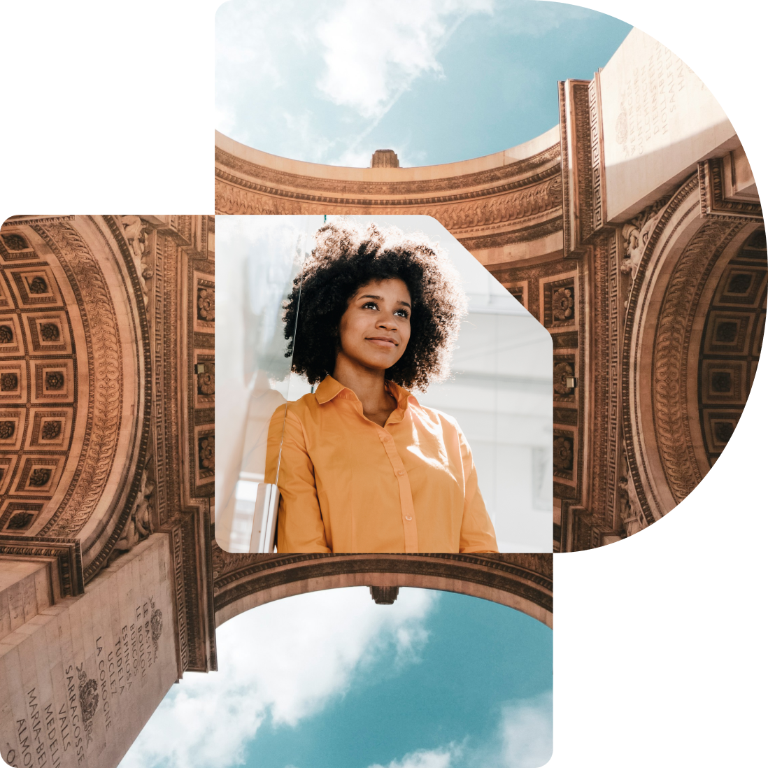
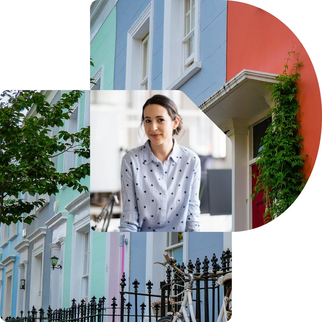
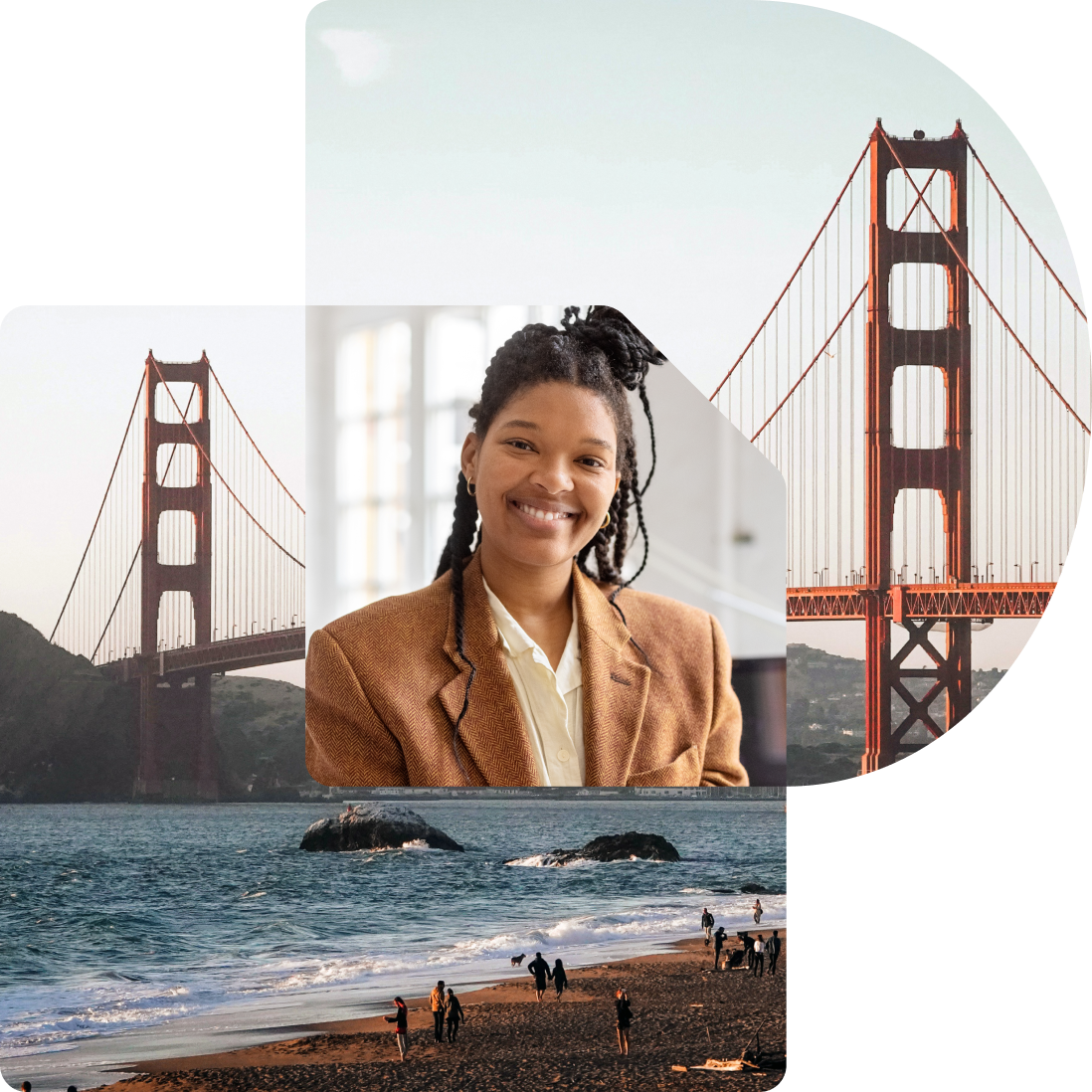
Containers
The Nexus can act as a dynamic container for masking photography. This creates very expressive applications, so it is best reserved for impactful communications like advertisements, video and motion graphics, website heroes, or social media.

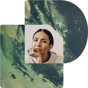

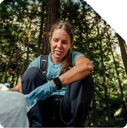
Photo masking guidance
Mind the focal point: Never crop a person or subject inside of the shape container where the focus of the image is being cut off or obscured by the shape’s top right angle.
A little goes a long way: Not every photo in a design should sit inside of the document mask shape—reserve it for moments of special interest or calls-to-action.
Simple & Textured Overlays
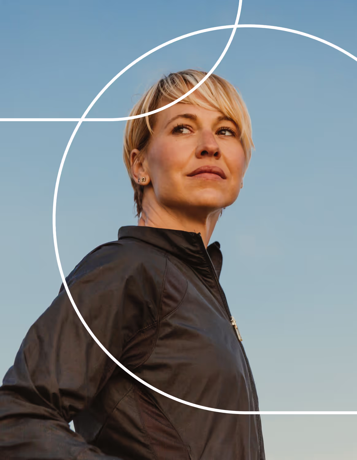

When our stroke outline overlays are activated through color and texture at the intersection with another object, it is one of the best representation of the visual principles of Connection and Dynamism.

When our stroke outline overlays are activated through color and texture at the intersection with another object, it is one of the best representation of the visual principles of Connection and Dynamism.