Logo
Our logo represents how agreements come together between parties, highlighting the collaborative foundation of our brand and product.
It is our most important visual asset, filled with symbolic meaning that realizes our brand promise of Bringing Agreements to Life.
Our logo conveys trust, confidence, and connection.
It is our most important visual asset, filled with symbolic meaning that realizes our brand promise of Bringing Agreements to Life.
Our logo conveys trust, confidence, and connection.
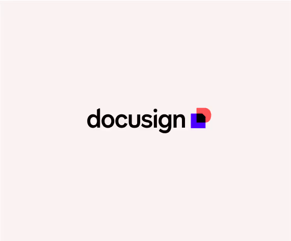
Our logo is made up of two parts—the Nexus icon and the Wordmark. The icon and wordmark must always be used together as shown. That means wherever you place it, make sure the materials are current and best reflect Docusign as it is today. All countries and languages must use the logo in this exact format.
Smallest usage size: 52px/.75” wide
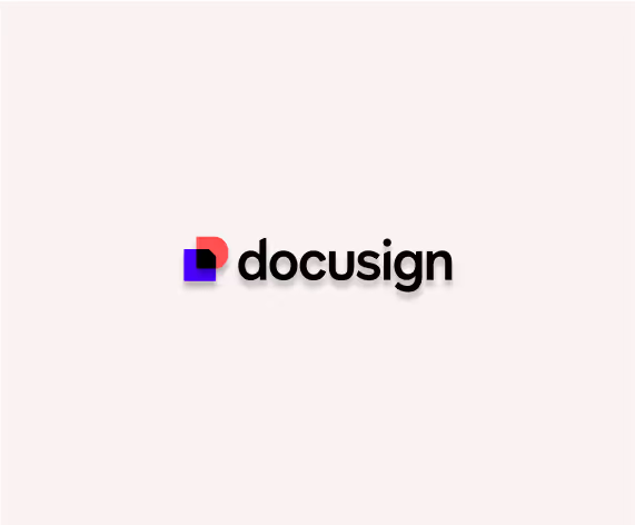
Vertical
Nexus Icon
The heart of our logo is the Nexus icon. It represents a convergence—an agreement, if you will—showing two shapes coming together. They form the shape of an agreement in the center.

The Nexus Icon helped shape our wordmark

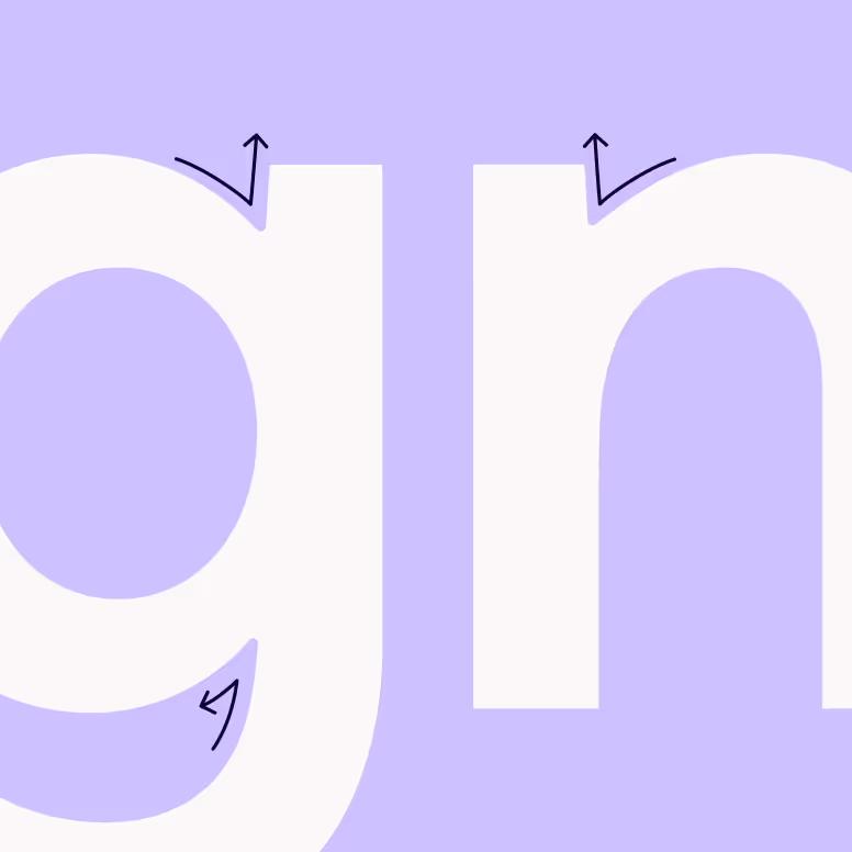
Our wordmark is based on our proprietary typeface, Docusign Indigo, but with specific customization made to the letterforms. The “d” and the “i” both have angular stems, similar to the agreement shape in the center of the Nexus icon. The “u” and the “s” are customized to sit side-by-side nicely and serve as a balanced anchor for the center of the wordmark. All letterforms have slightly rounded inktraps at their joints.
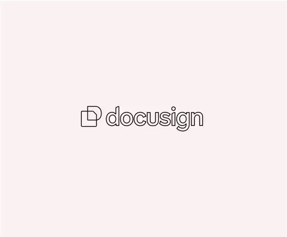
Legibility
For the horizontal logo orientation, maintain a clear space that is equal to the width of the Nexus. For the vertical orientation, maintain a clear space that is equal to the width of one of the shapes in the Nexus.


Trademark
Docusign's trademark is affixed to the bottom right of the wordmark, and should be included wherever possible.
Logo Variations


Striking the right balance between differentiation and association is paramount. These logo lockups allow us to pair our base identity with products, sub-brands, or brand elements like our tagline.
Co-Branding
Set co-branded logos next to or under the Docusign logo with a simple rule divider. The lockups you create depend on the shape of the partner logo and its brand standards.
Many logos contain a word mark. In these cases, use the wordmark and align it to the baseline of the Docusign logo. For logos with other artwork, try to achieve the same visual “weight” as the Docusign logo. For vertical lockups, stack the logos with a rule divider. Center align the partner logo to the width of the Docusign logo.
Many logos contain a word mark. In these cases, use the wordmark and align it to the baseline of the Docusign logo. For logos with other artwork, try to achieve the same visual “weight” as the Docusign logo. For vertical lockups, stack the logos with a rule divider. Center align the partner logo to the width of the Docusign logo.
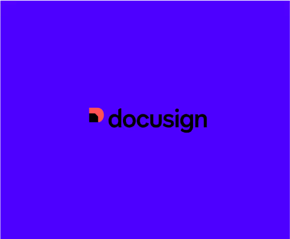
One-Color Versions
In situations when a background would not allow the full-color mark to have adequate contrast—such as placed over a flood of our brand Cobalt, a gradient, a photograph or texture, or in special circumstances such as limited-color printing, embroidery or manufacturing—the one-color version of the logo can be used, wherein the center of the Nexus is knocked out and the entire icon and wordmark lockup are set in either white or black.
If the logo is placed on a photo, make sure that it is an uncluttered image so that the mark is legible. Always place the logo in white or black, whichever has the most contrast from the photo. Place the logo in a space of the photo that won’t be in competition with the content, color, or composition of the image.
Misuses

Do not stretch the logo horizontally or vertically.
Do not use the wordmark or icon by itself.
Do not rotate the wordmark or icon.
Do not change the placement or relationship of the icon and wordmark.
Do not put a drop shadow on the logo.
Do not put a stroke on the logo.
Do not place the full color logo on color fills where it would lose contrast.
Do not place the full color logo on color fills where it would lose contrast.

Do not place the one-color logo when
the full color version is possible.
the full color version is possible.

Do not place the full color logo over a clashing photo or texture.

Do not place the one-color logo in white over a light photo or texture.

Do not place the one-color logo in black over a dark photo or texture.