Color
Color is dynamic.
It creates tension.
But also agreement.
So, we created a spectrum that contrasts, harmonizes, adapts, and strikes a careful balance between focus and overemphasis.
Stand out thoughtfully. Fit together beautifully.
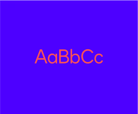
Cobalt
Hex 4C00FF
RGB 76, 0, 255
CMYK 88,79,0,0
Pantone 2368
Inkwell
Hex 130032
RGB 19, 0, 50
CMYK 94, 93, 0, 79
Pantone 276
Deep Violet
Hex 26065D
RGB 38, 6, 93
CMYK 99, 98, 0, 35
Pantone 2755
Mist
Hex CBC2FF
RGB 203, 194, 255
CMYK 36, 32, 0, 0
Pantone 2705
Poppy
Hex FF5252
RGB 255, 82, 82
CMYK 0, 93, 82, 0
Pantone 1788
Ecru
Hex F8F3F0
RGB 248, 243, 240
CMYK 12, 10, 14, 0
Pantone 7527
Gradients
Pearl
Ecru to White
F8F3F0 to FFFFFFAtmosphere
Mist to Cobalt
CBC2FF to 4C00FFHaze
Cobalt to Deep Violet
4C00FF to 26065DGlow
Poppy to Cobalt
FF5252 to 4C00FF
The gradients palette consists of an approved set of four swatches: Pearl, Atmosphere, Haze, and Glow. These have been designed to most effectively combine the colors of the Docusign palette while still creating options for possible expressions ranging from light- to dark-themed designs, as well as more vibrant and energetic design.
Usage & Ratios
In order to achieve a consistent look in Docusign branded materials, our color palette should be weighted with appropriate ratios.
On a light-theme design, the majority of the surface should use White or Ecru as the background. Headline text should be set in Inkwell, and Cobalt should be used as a bold accent where appropriate. On a dark-theme design, the majority of the surface should use Inkwell or Deep Violet as the background color. Headline text should be set in White, Ecru, or Mist, and Cobalt should be used as a bold accent where appropriate.
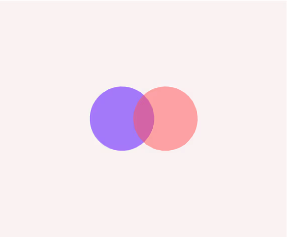
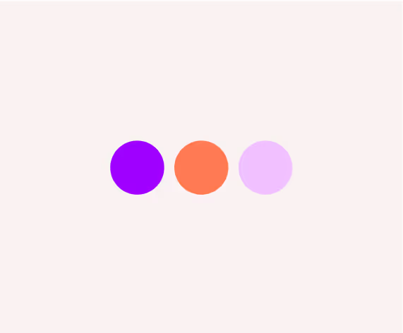
Color Combinations


Text
[FPO] Top Layer is xyz
Graphic Elements
[FPO] Top Layer is xyz
Backgrounds
Top Layer is xyz
Colors in Use


Accessibility


Misuses