Motion
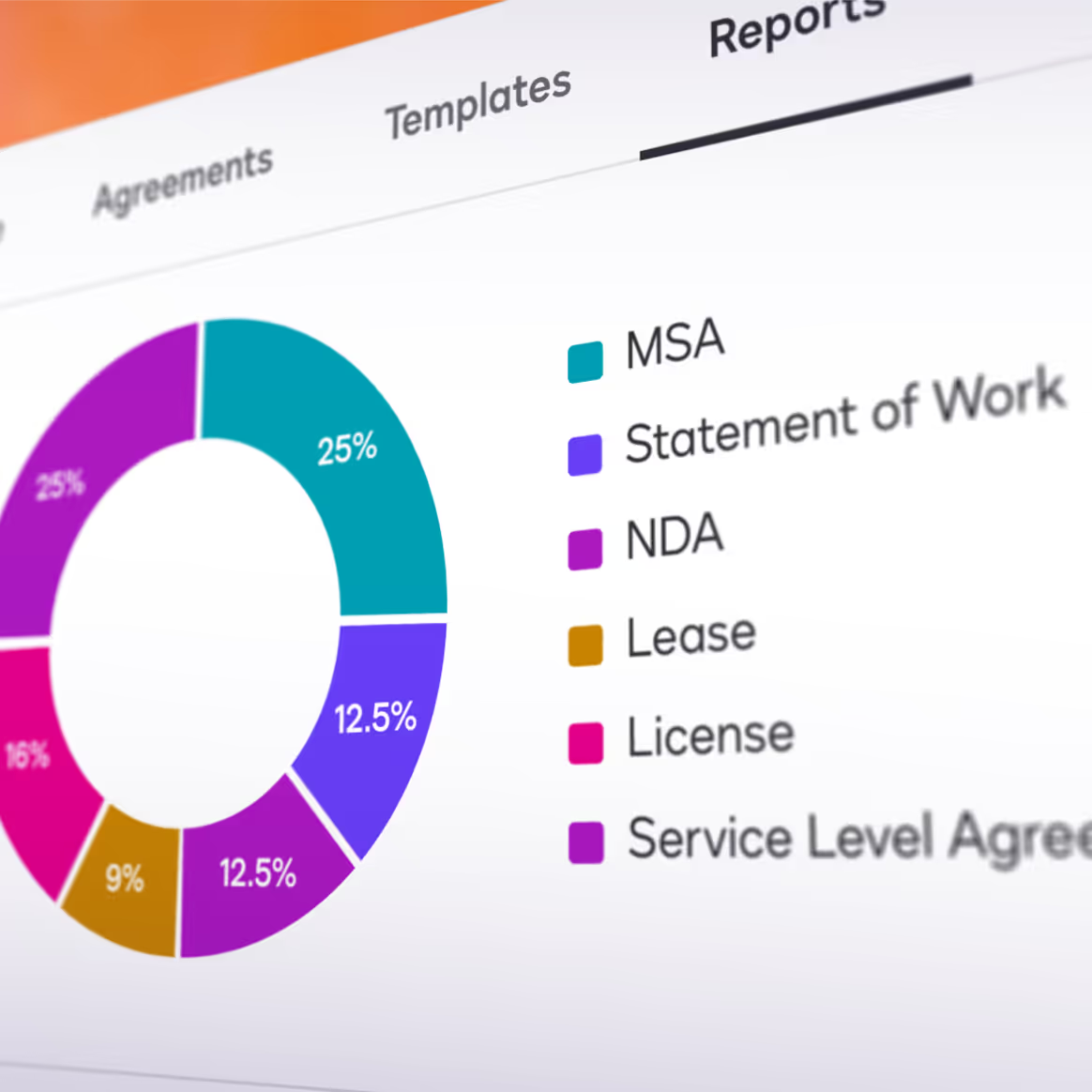
Motion infuses our brand with energy and dimension, elevating static elements into dynamic experiences that engage and delight.
Our thoughtful approach to movement creates a signature feel that enhances usability while reinforcing our personality through carefully crafted transitions, easing, and timing.
Motion Principles
Clear
When we use motion, its purpose is to transform complex concepts into simple and understandable ones. Transitions and animations should guide, not distract.
Structured
While motion inherently adds delight, it should still feel refined and intentional. A viewer should never feel that motion is surprising or jarring.
Empowering
Motion should help a viewer feel that they are in control. When we create animation, a primary goal should be to show viewers that we are leaders in the subject matter.
Delightful
Motion adds emotion to the brand. Through the use of glows, reflections, shadows, light, and camera movements, we create a sense of delight.
Logo Animation
Camera & Framing


Transitions
Window—The Shape of Agreements can be used as a general transition for impactful moments. It can also be used when transitioning from graphic elements to footage.
Scroll—Footage zooms out slightly and scrolls up or down depending on context, masked by an extended shape of agreements container.
Devices
Abstract Backgrounds
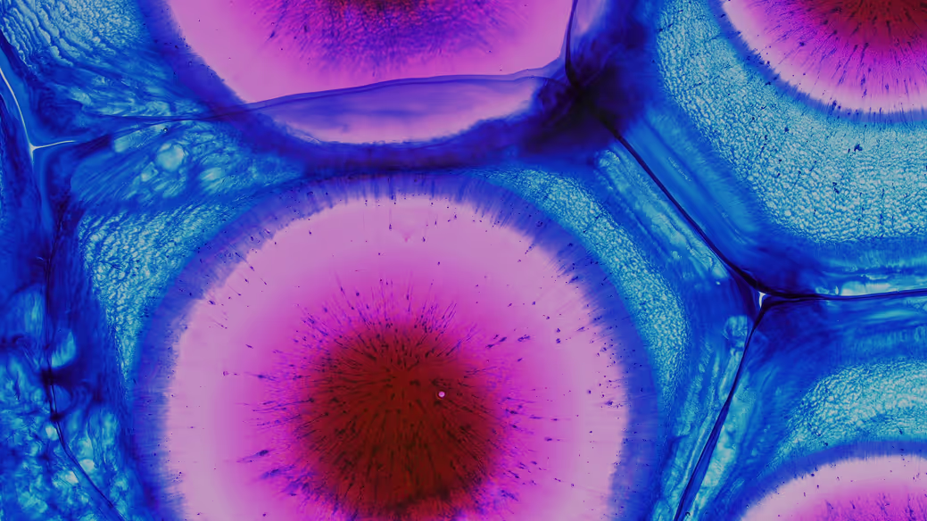
When working with abstract backgrounds, you should always work with a color palette that complements the existing brand palette.
When working with abstract backgrounds, you should always work with a color palette that complements the existing brand palette.
You should always look to use micro/macro graphical elements. The applied affect will help provide contrast and aid in not distracting from the main focus of the content.

